Robi Self Care
Designing Contextual Interfaces for telecom products to Make Better Decisions

Overview
Robi Axiata Limited is the 2nd largest telecommunications operator in Bangladesh, with over 54 million users. In 2019, Robi was receiving a large number of calls and support requests for configuring products and services that users can easily complete through the website. Robi wanted to reduce the number of support calls by making the self-care system more helpful and user-friendly.
Project Role
- Product Designer
Led the user research and prioritized features for development - Lead UX/UI Designer
Designed the interface for selfcare for integration to the website
Design Challenges
The goal of the project was to make the users’ purchase decisions more effective. The following key problems were identified from market research, user data analytics, and customer feedback
Need for Granular Control
Some of the Robi services are auto-activated whereas some need manual activation. Users expect granular yet easy-to-manage control over their account elements.
Lack of Clarity about Current Status
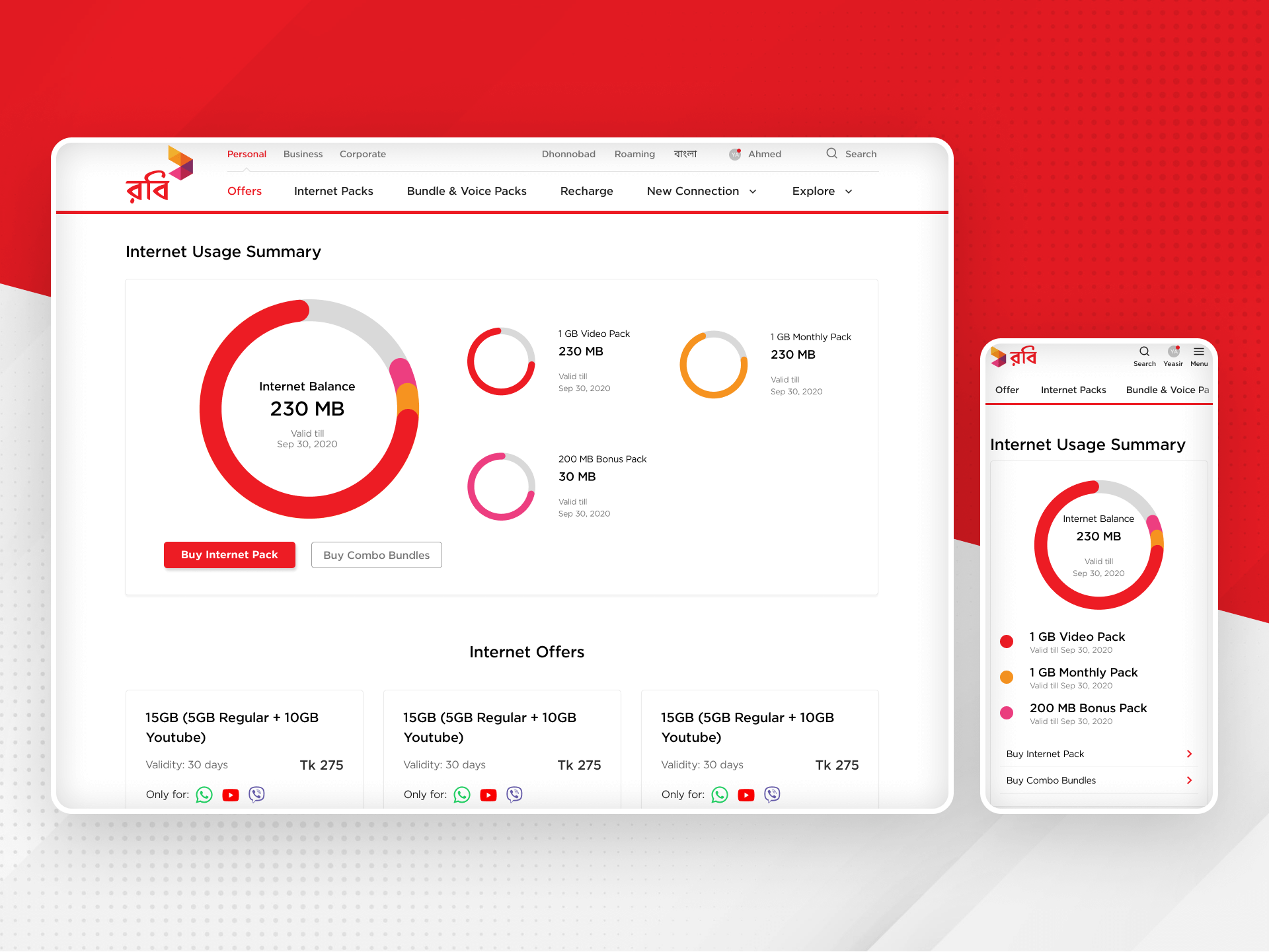
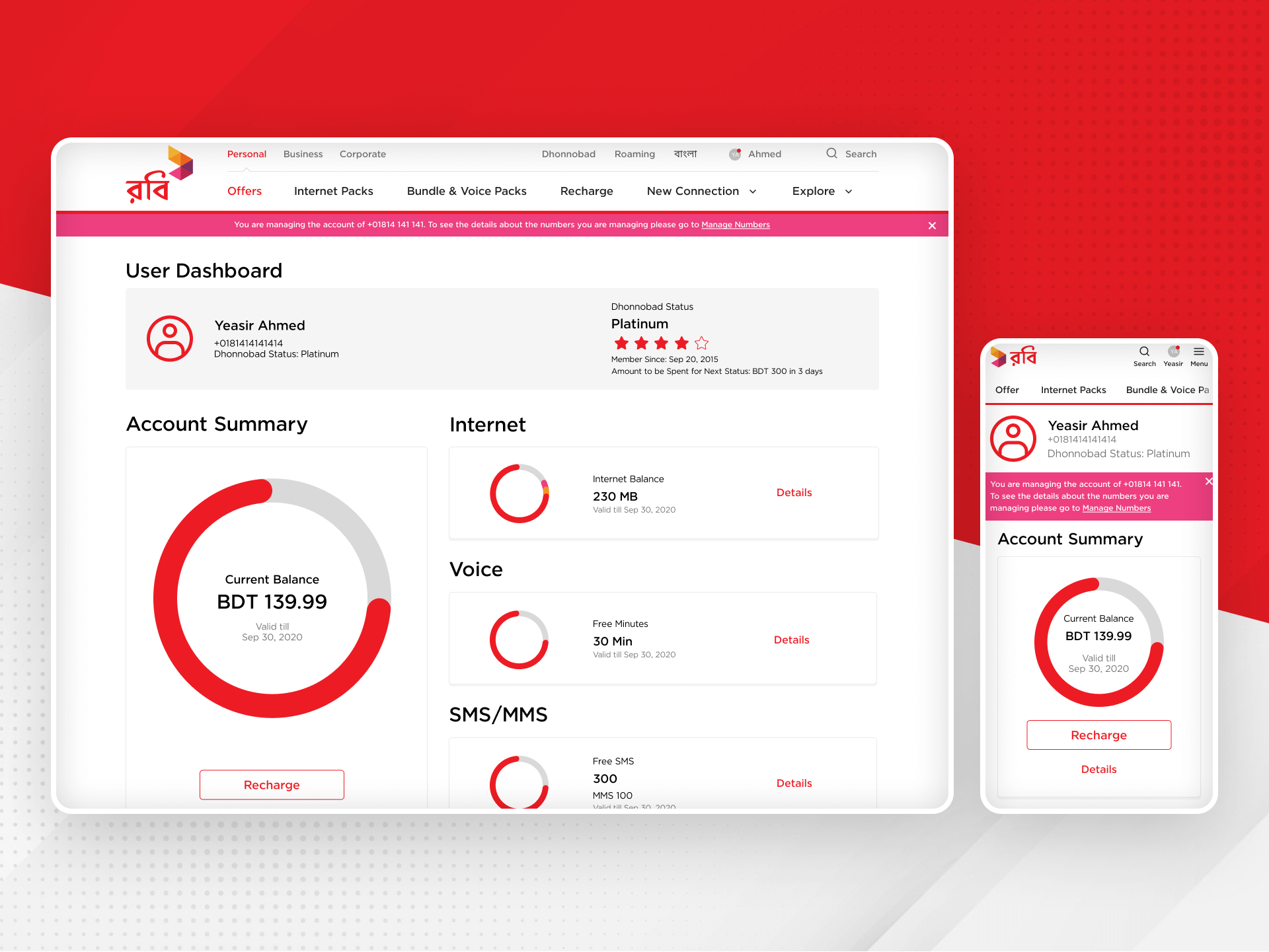
Since each active connection has a lot of components (account balance, voice balance, internet data balance, loyalty status, etc.) users find it difficult to keep track of all the elements. There is a need for top-level summary for users.
Difficulty in Finding the Best Offers
Robi offers a wide range of products and services to its customers. Customers often miss out on the most optimum products or buy the wrong ones because they do not analyze their usage patterns systematically.
Design Solutions
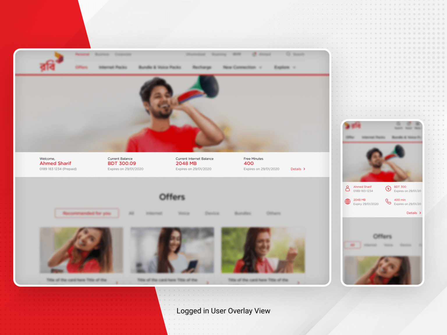
Provide Contextual Information
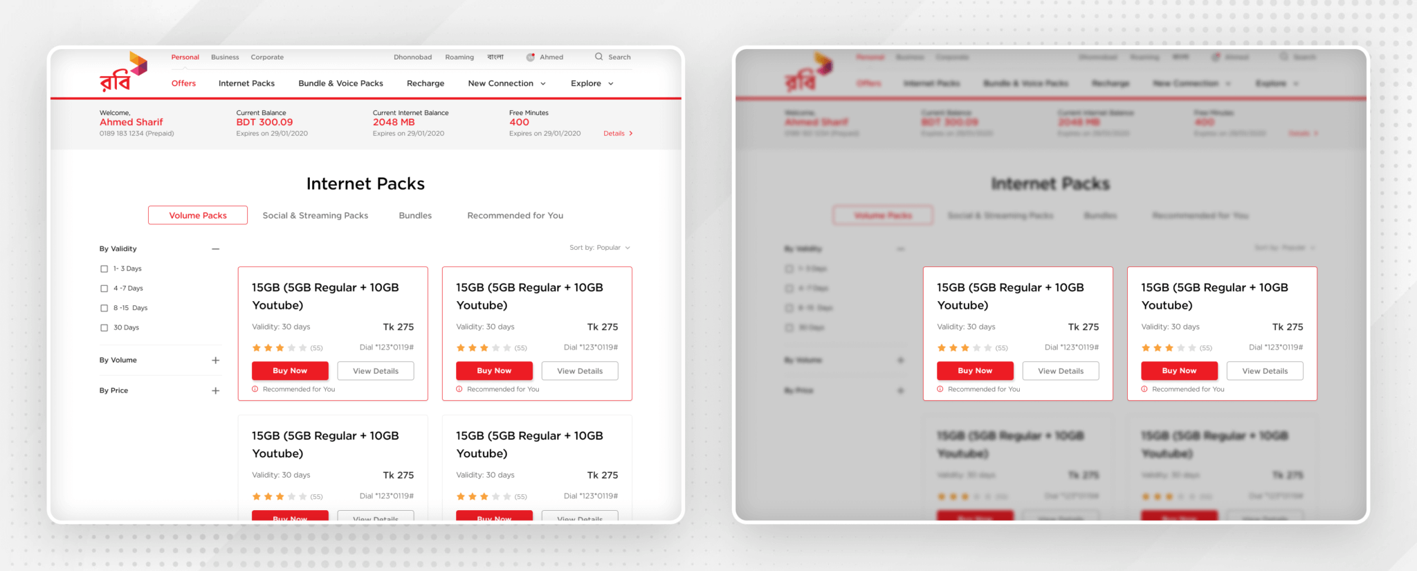
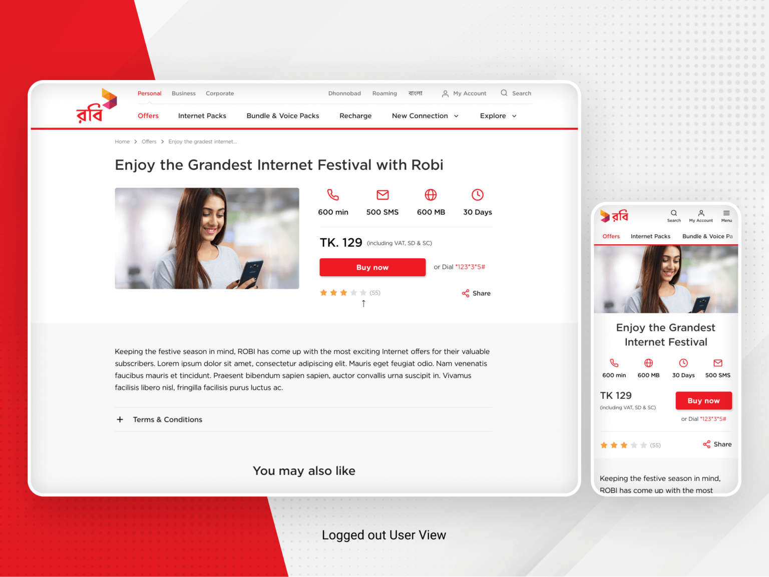
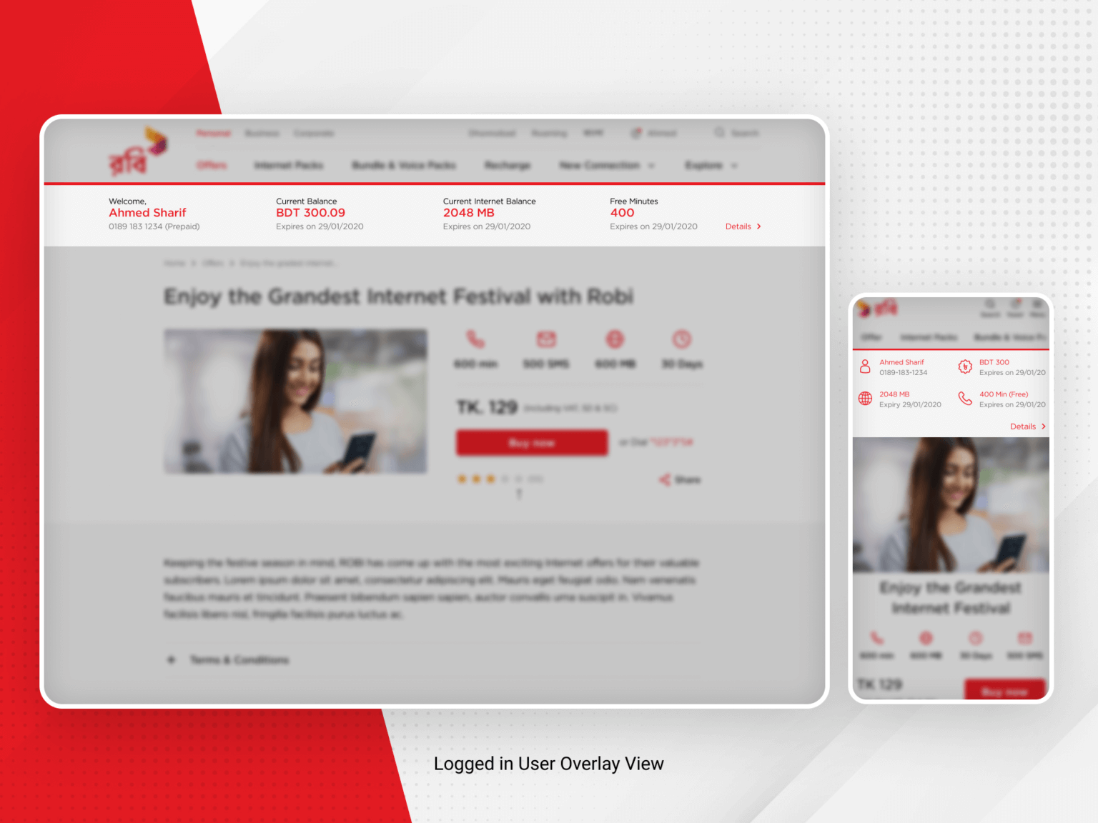
The core design solution involved providing accurate contextual information to users. I designed an overlay interface template for every product/service that provided just the right amount of information about the user’s account needed to decide on that product or service. For example, data products only highlight the user’s current data balance, account balance and any active bonuses. Any Purchase button also shows the current balance of the user’s account right in the button.
Keep Existing Interface Intact
The contextual information panels were integrated seamlessly with the existing web interface to maintain users’ familiarity. Existing design system was utilized very carefully while still highlighting the new set of contextual information.
Recommend Based on Usage
Based on the user’s past history and usage pattern, certain products were highlighted as “recommended for you” so that users receive personalized recommendations. This ensured users do not purchase items that are not properly utilized and hence reduce customer dissatisfaction.
Account Management Interface
Apart from contextual information, a full account management panel was created to give the users granular control over every part of their account. Power users who want to have full control over their usage were the primary target group for this pane. This ensured a great deal of transparency in an industry where it’s often overlooked.
